Mid Century, West Portal.
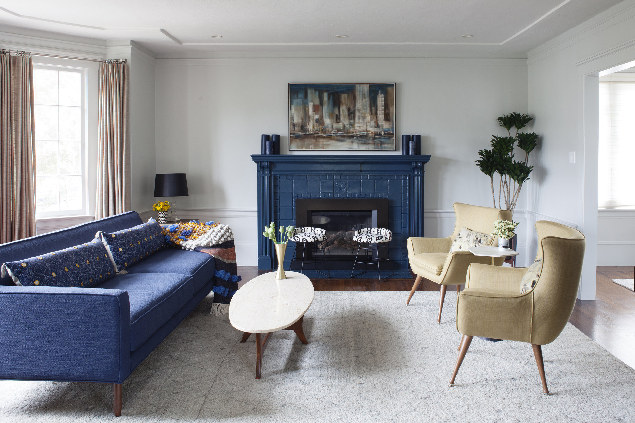
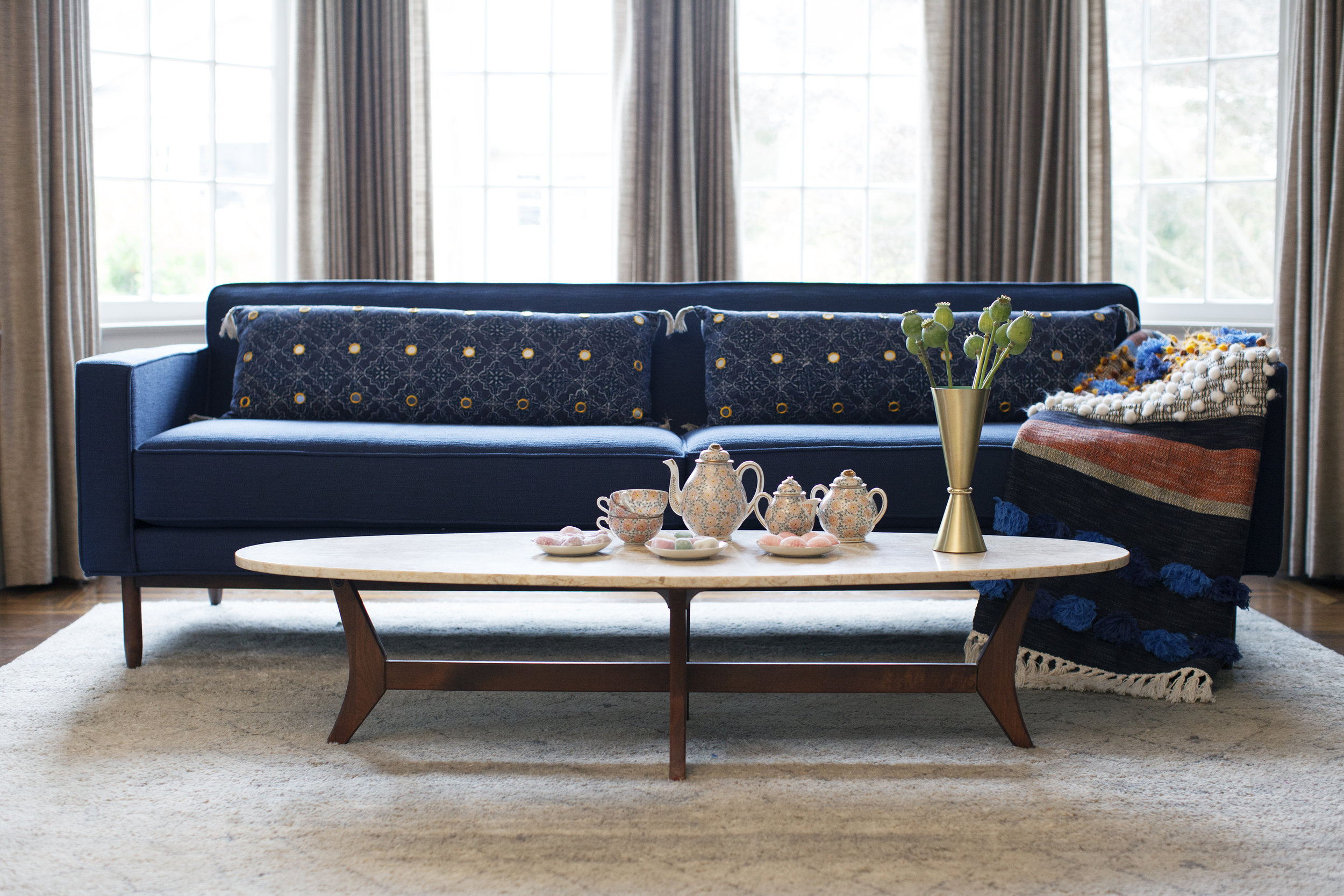
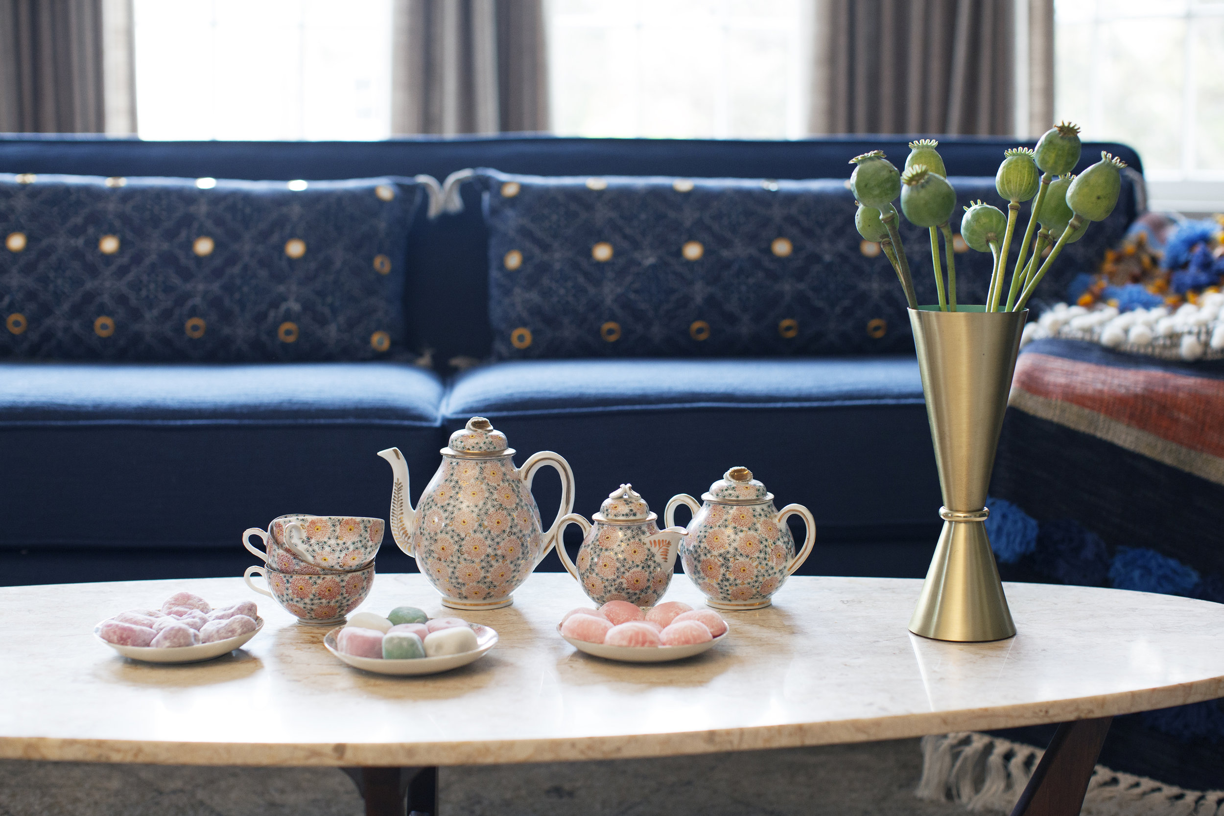
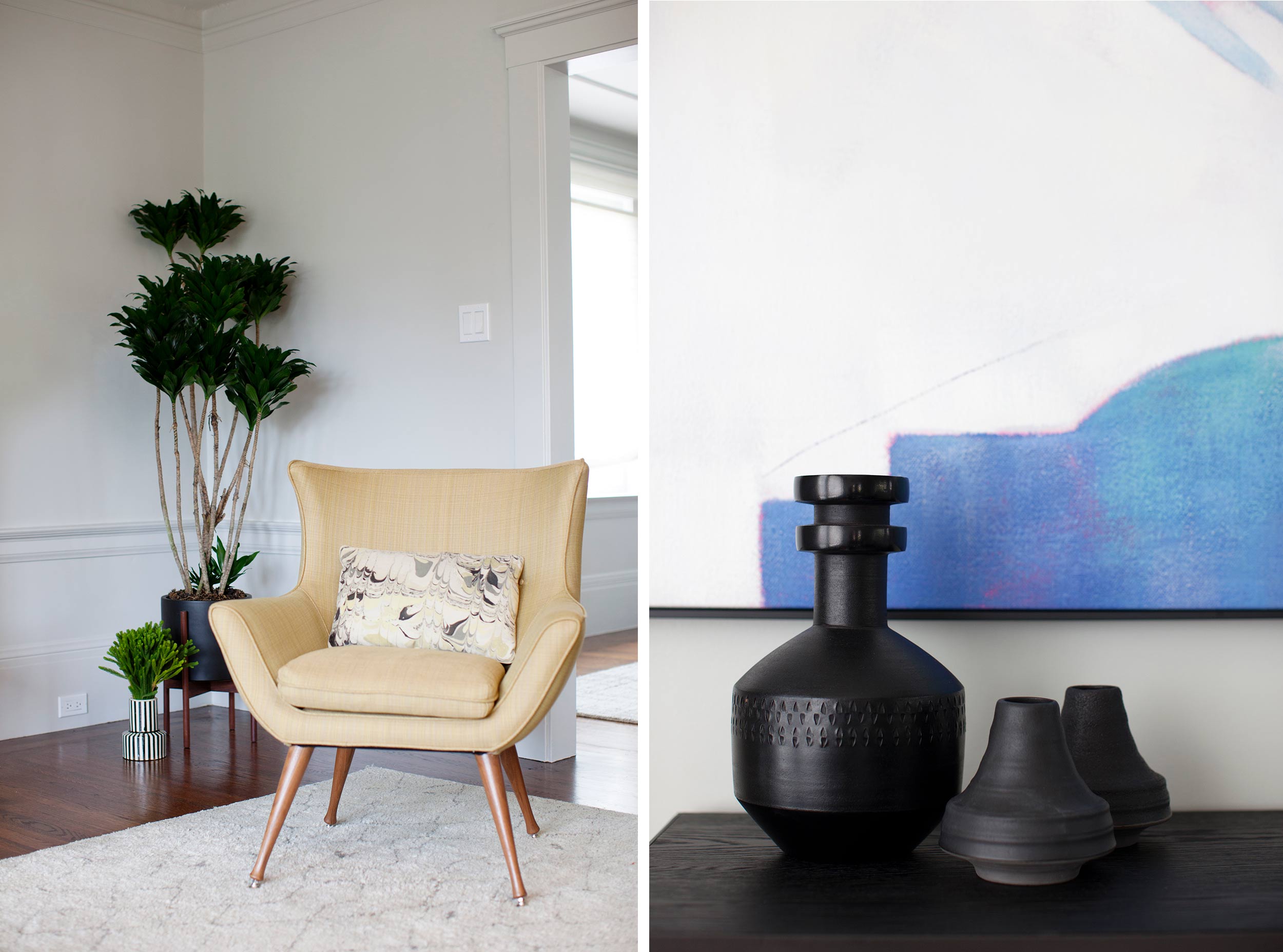
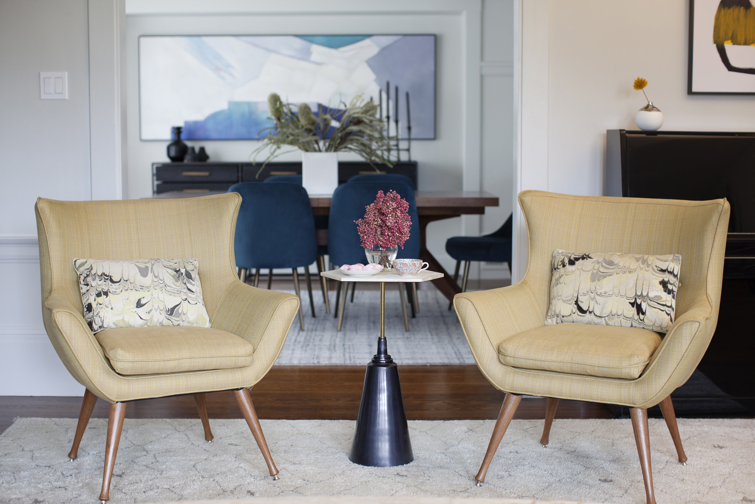
THE CLIENT'S LOVE OF BOLD COLORS, SUCH AS NAVY AND MUSTARD, AS WELL AS MID CENTURY FURNISHINGS ARE REFLECTED THROUGH THIS HOME.
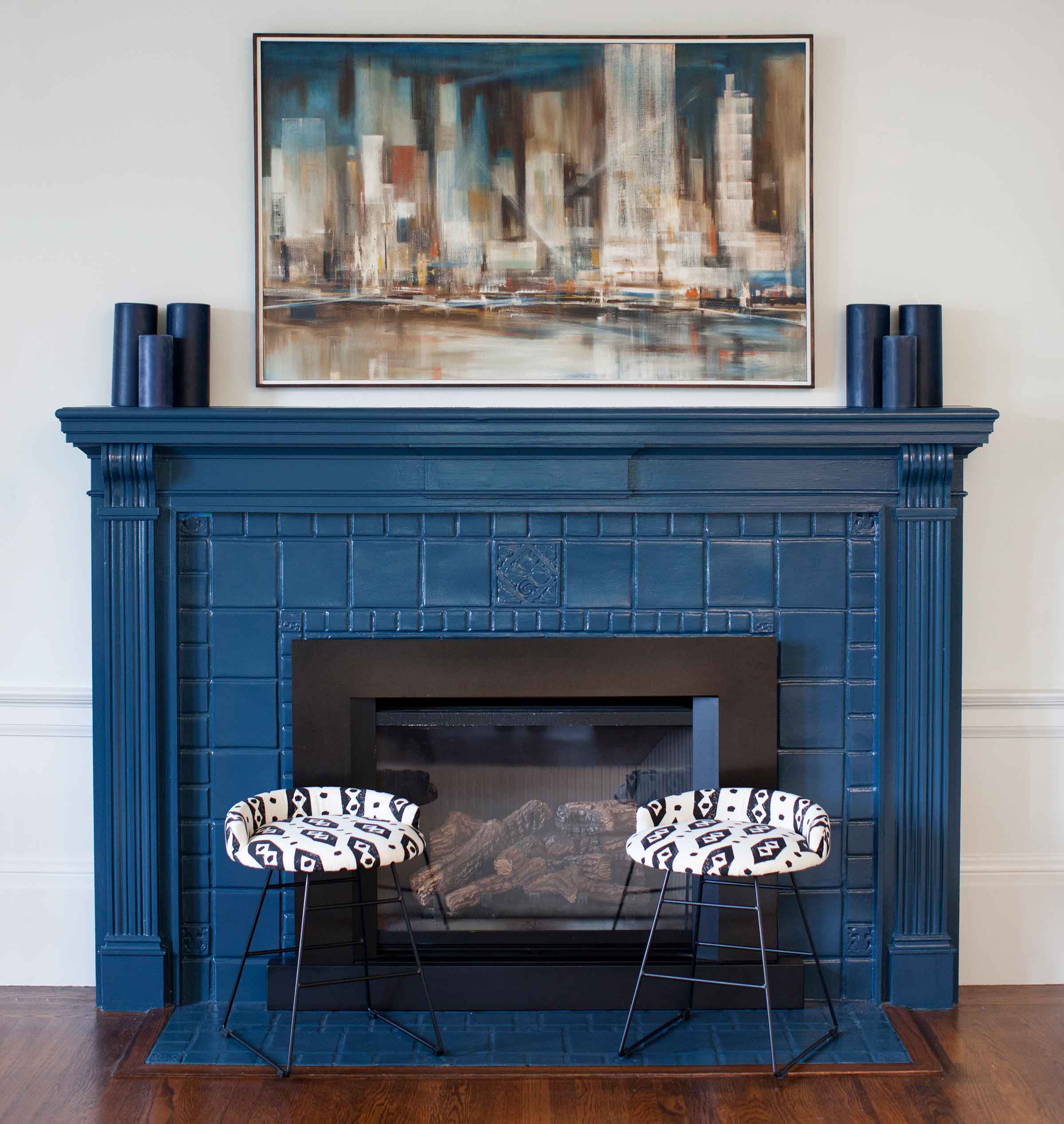
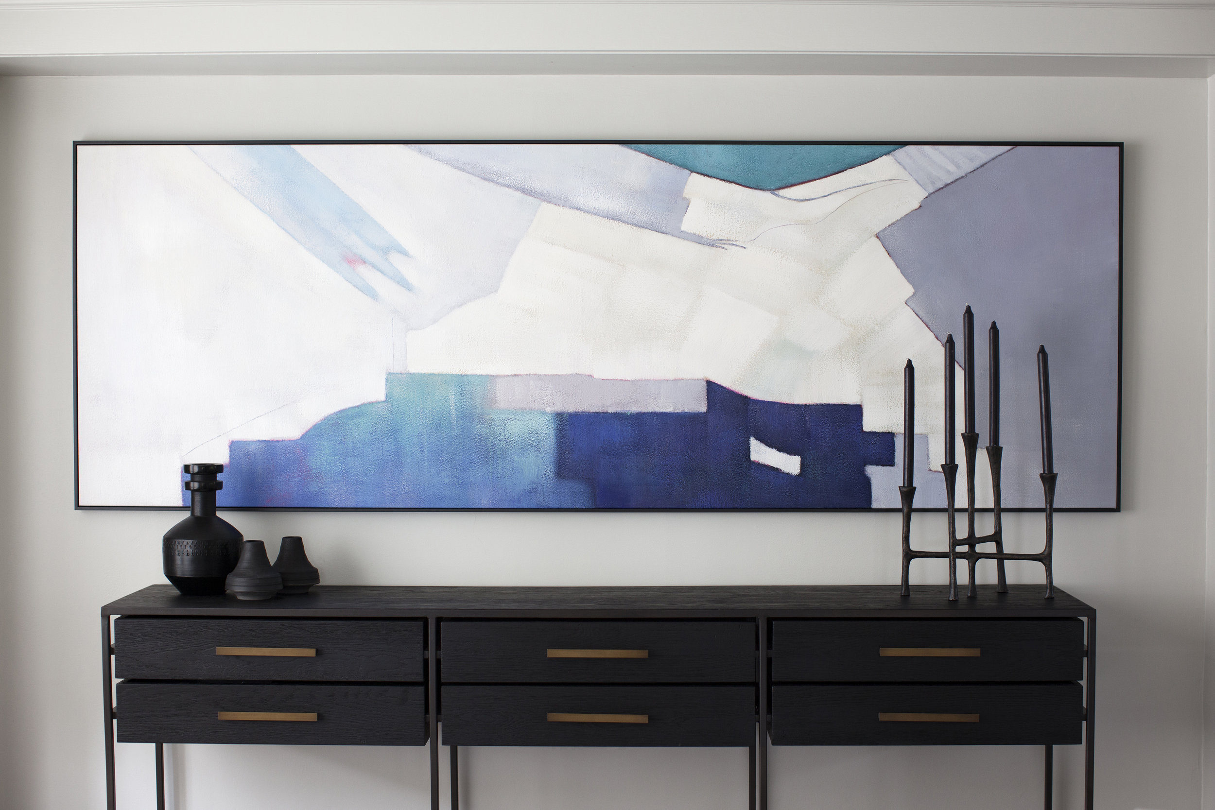
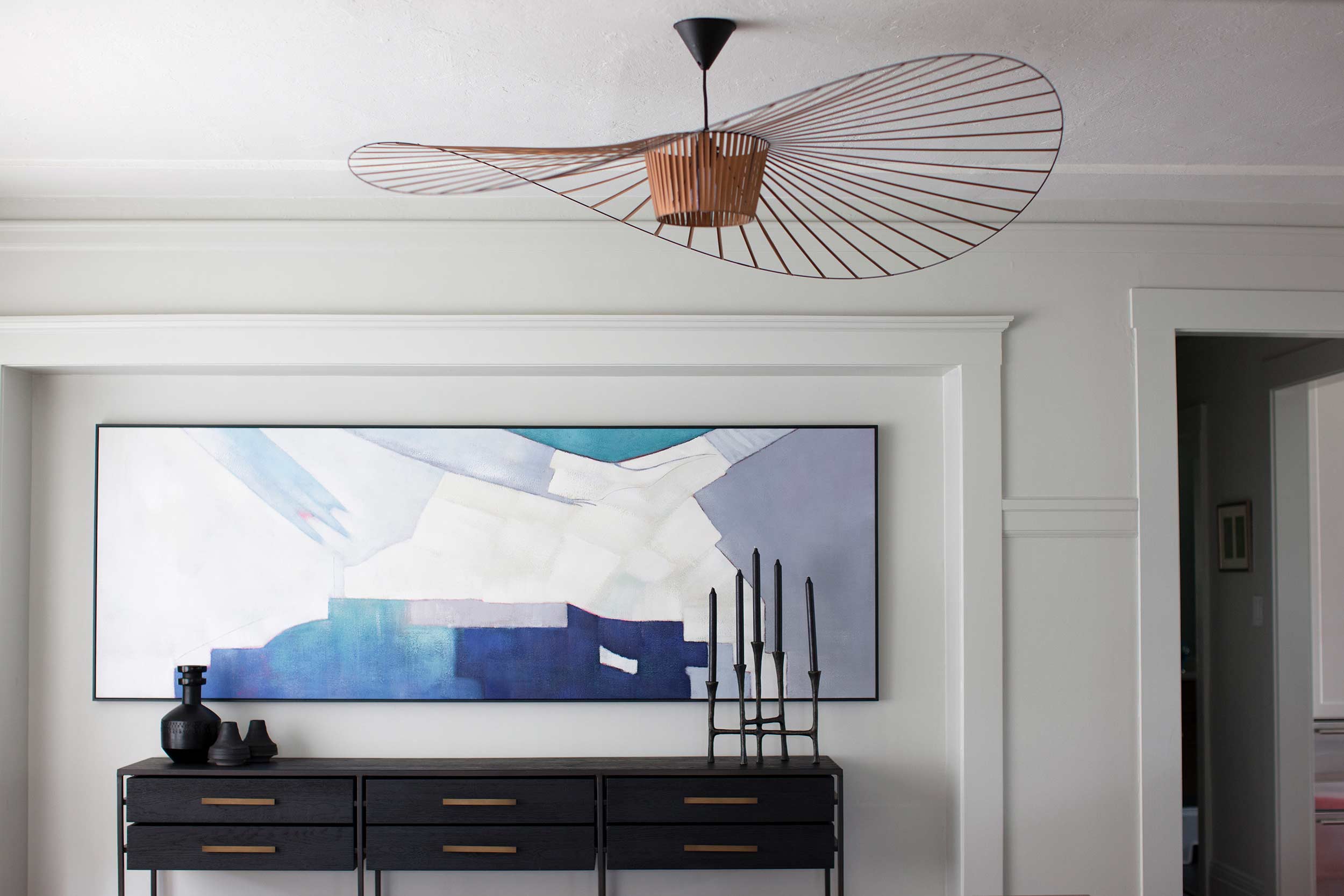
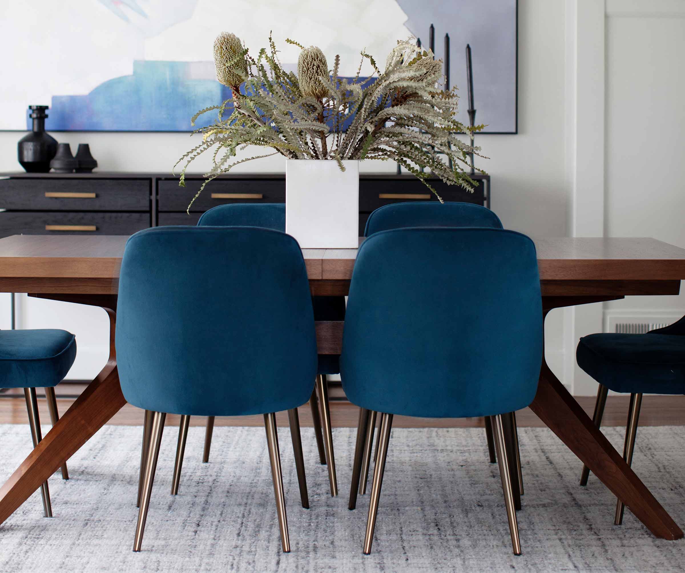
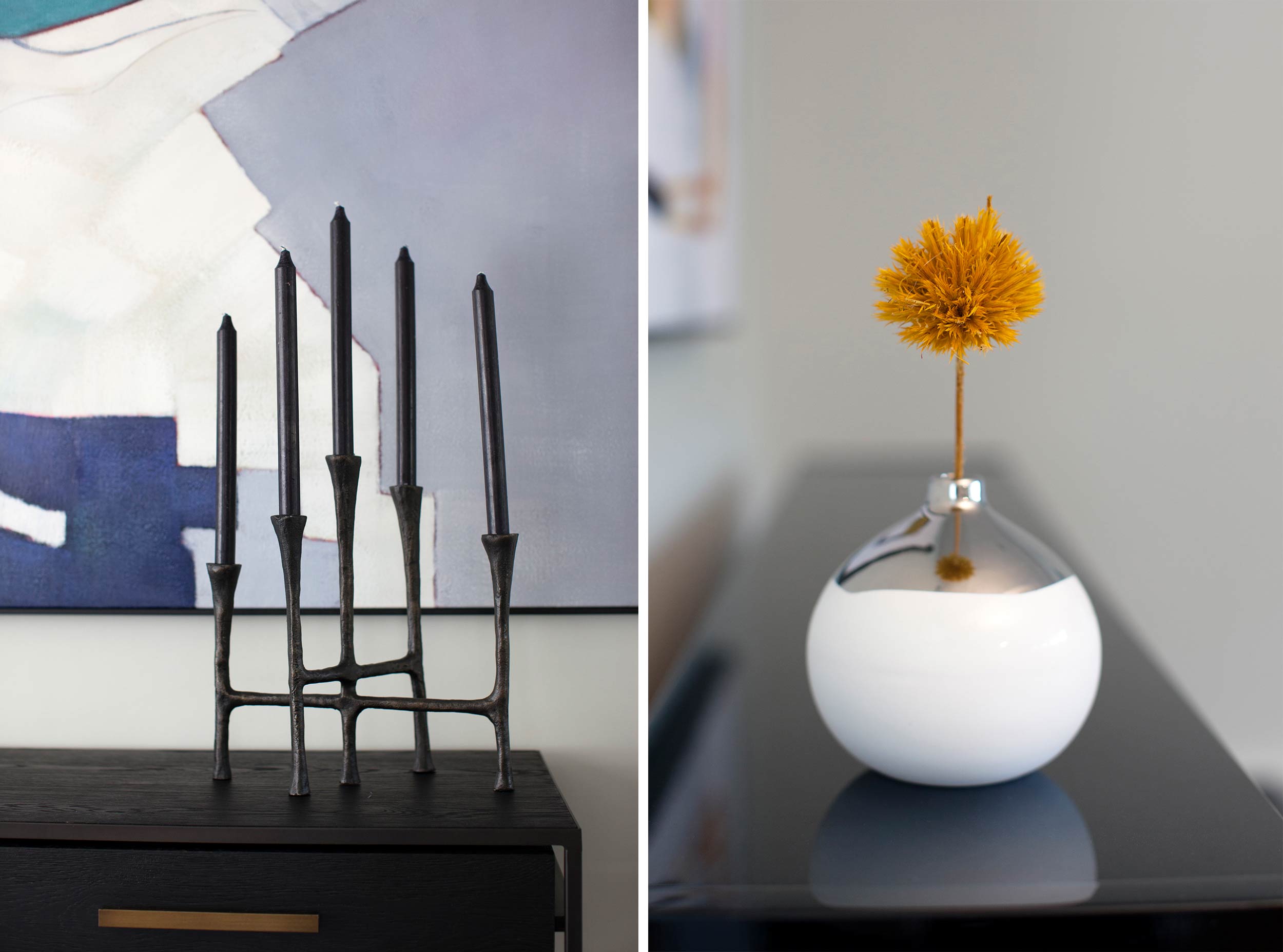
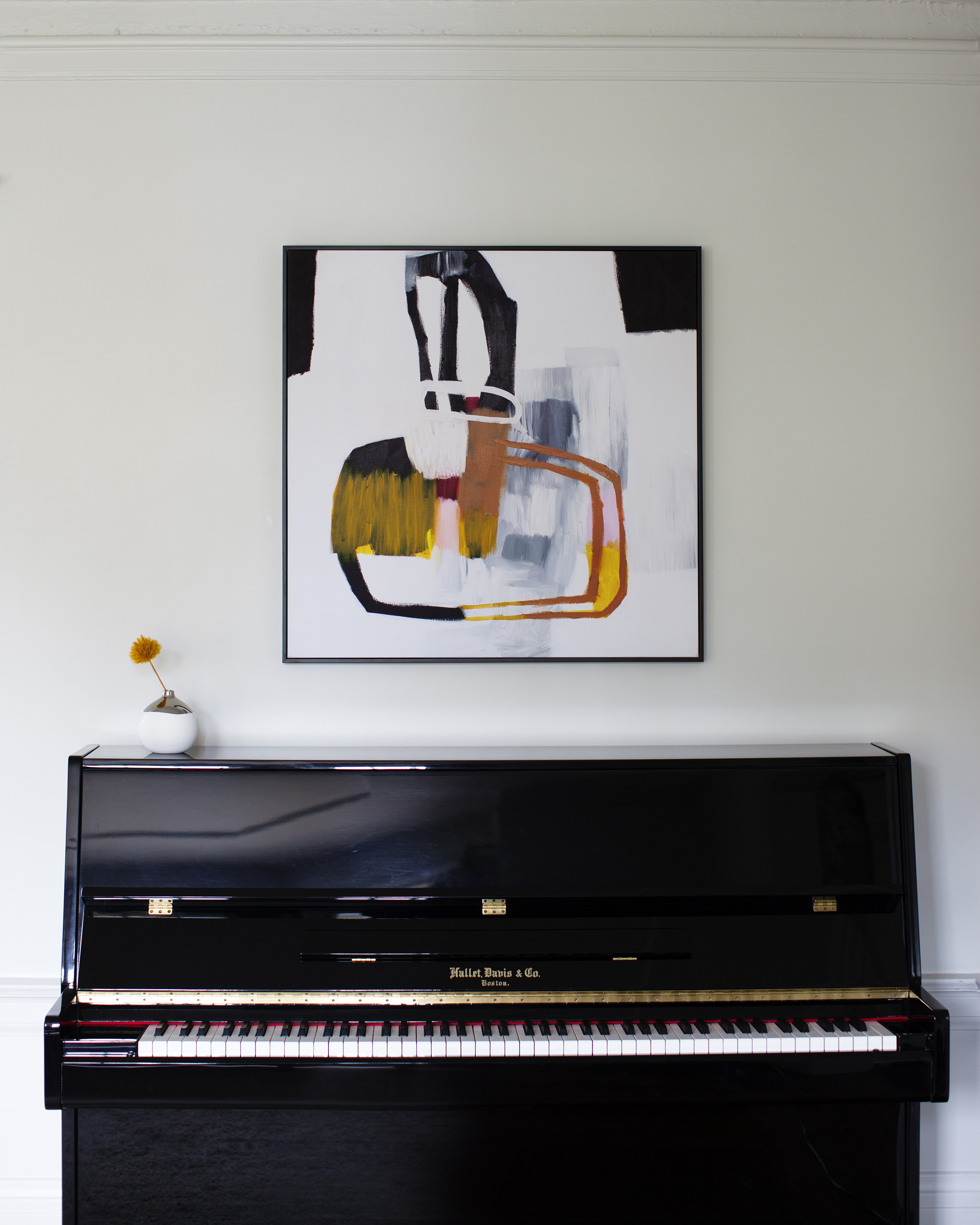
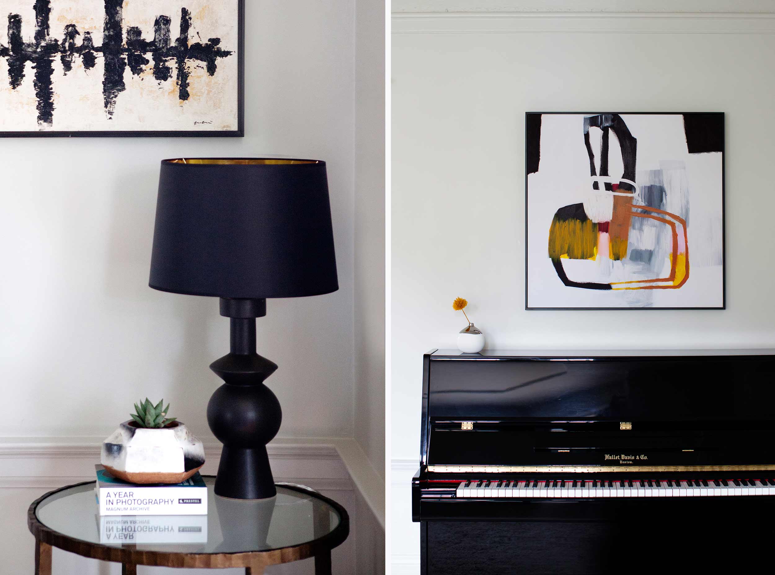
This living room had outdated furnishings, a generic light and a busy paint job. Although the ebony walls (see before photos)were a bold and cool choice, the white trim chopped up the look. To calm down the room we chose a light grey paint and painted all trims the same color. We found a painting that filled the space of the nook which made the room feel more organized, unlike the small out of place mirror in the before photo. In choosing the art piece, we looked for soothing colors that fit in with the client’s home. The wife wanted an abstract painting and the husband was geography major so this painting was a great piece reflecting both of their tastes, as well as filling out the wall space perfectly. The carpet blends in with the grey walls and the blue in the painting and chairs is a color repeated into the a joining living room - the repetition of color helps the brain peacefully and unconsciously organize the vibe of the room. We picked a console with storage for the client’s children's art supplies to eliminate stressful visual clutter when not in use.
Click below to see some before photos.


